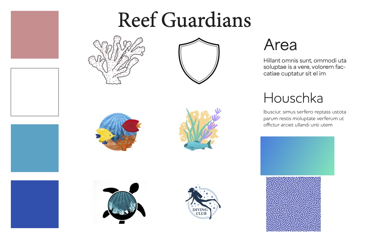
Background
Original logo.
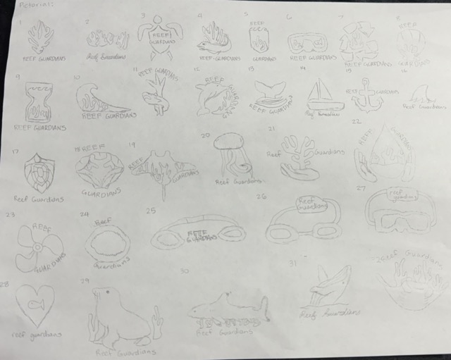
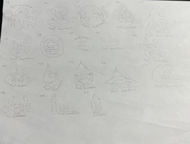
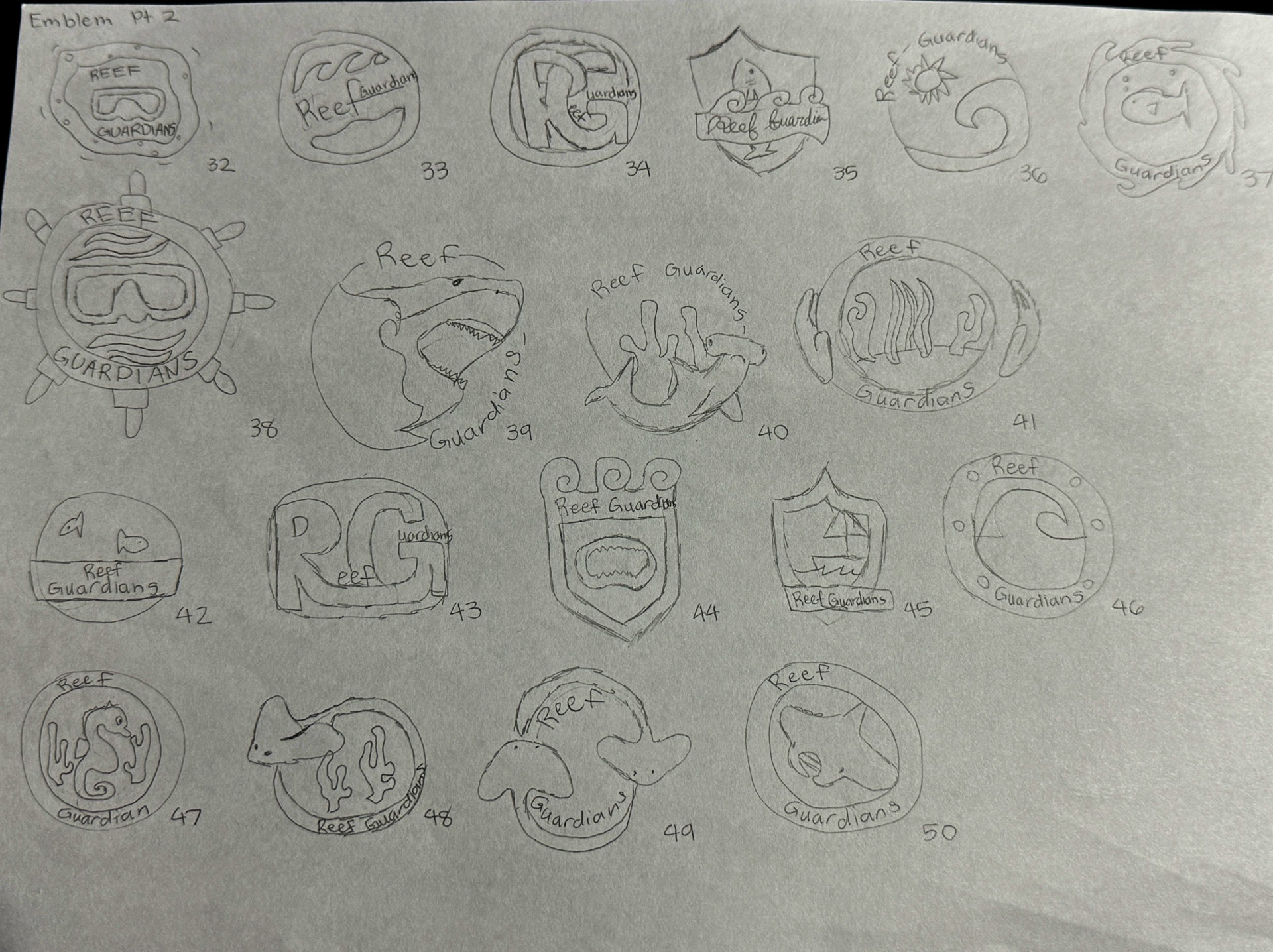
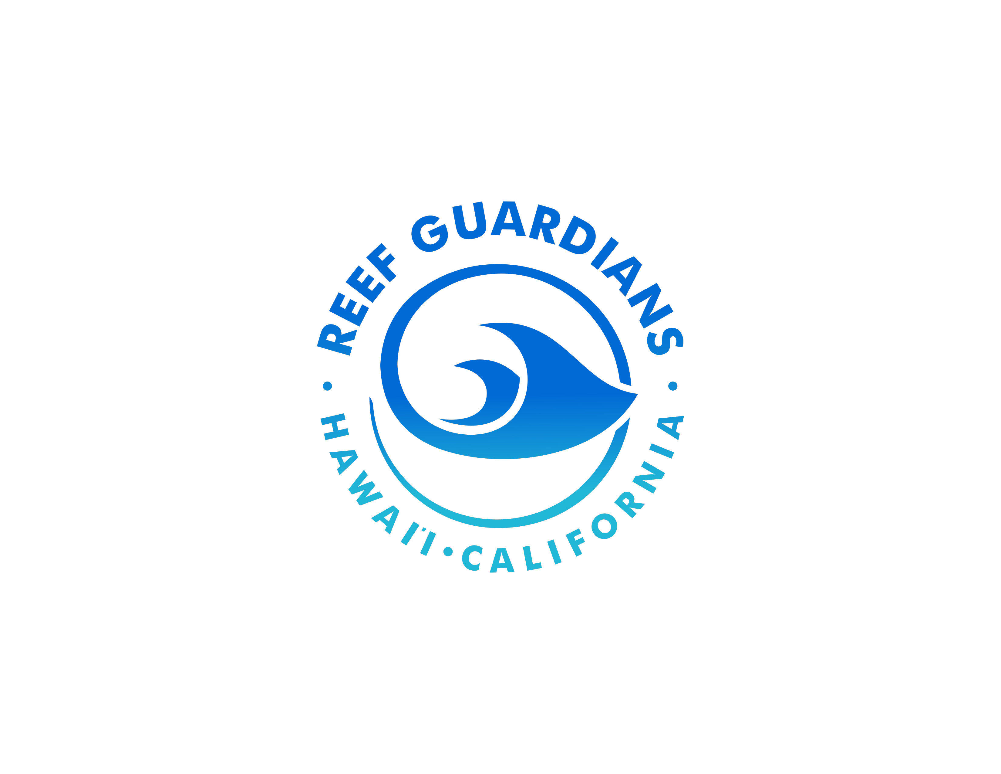
With this project, I was tasked with redesigning a logo for a non-profit organization. I decided to go with Reef Guardians due to their actions taken towards taking care of the ocean's reefs.
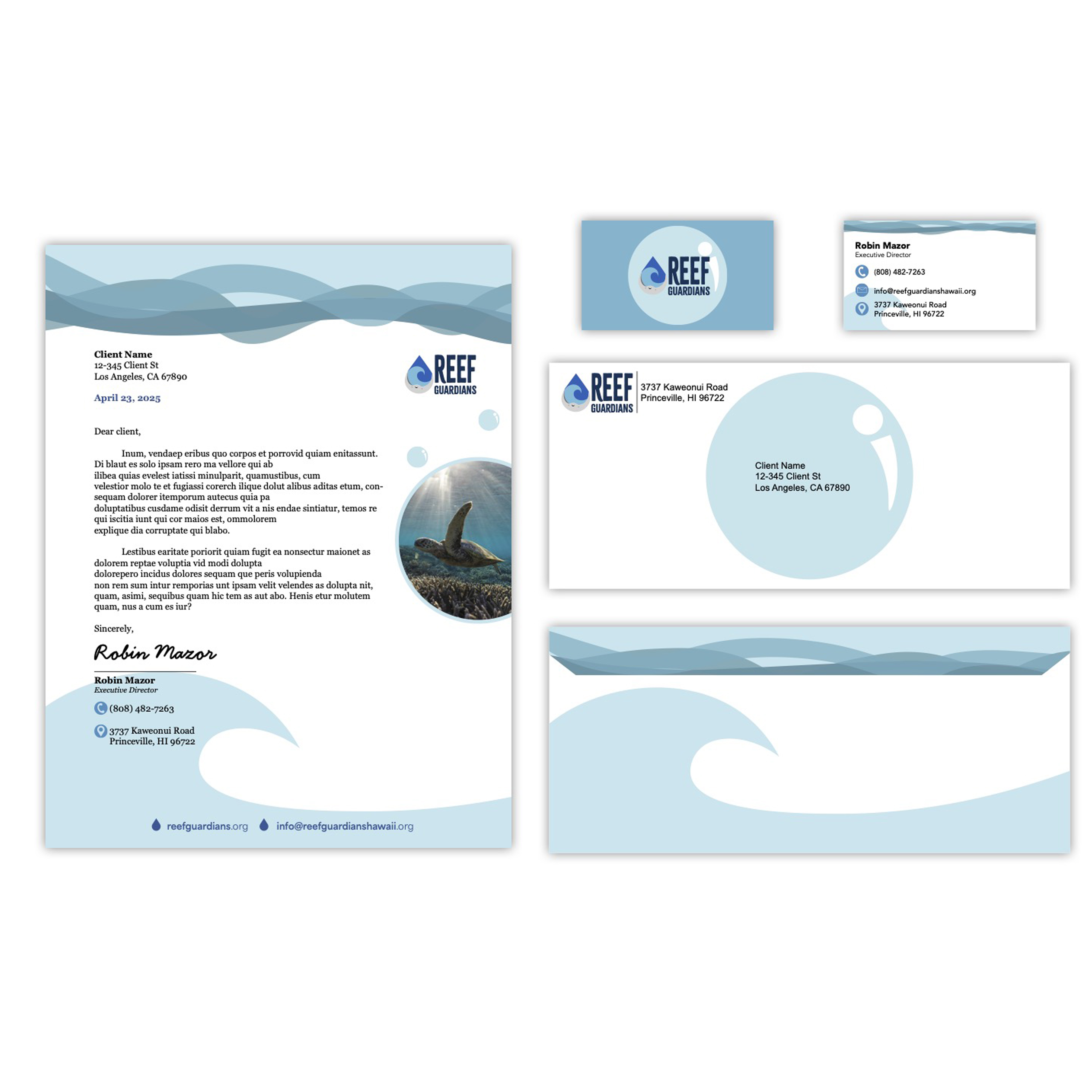
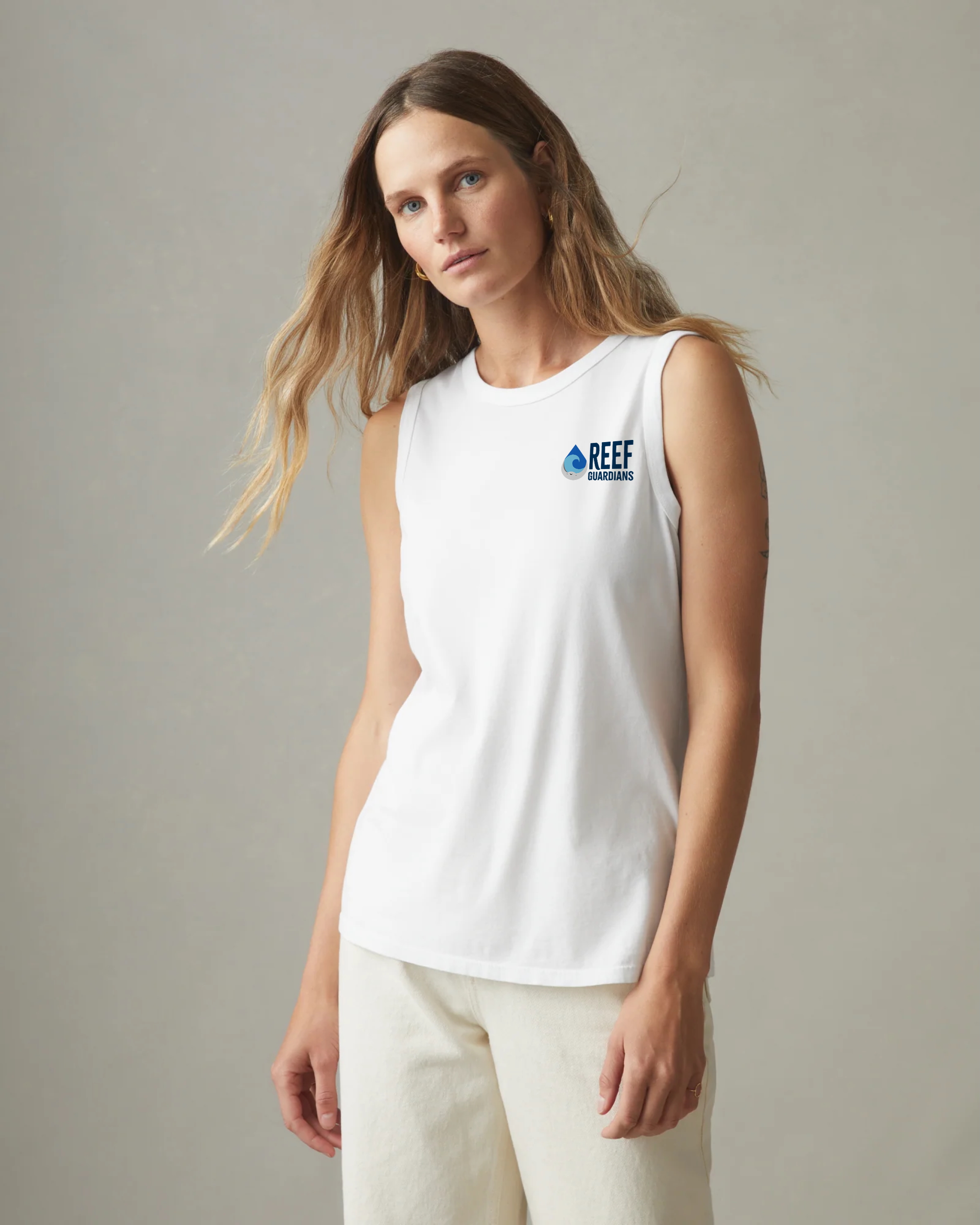
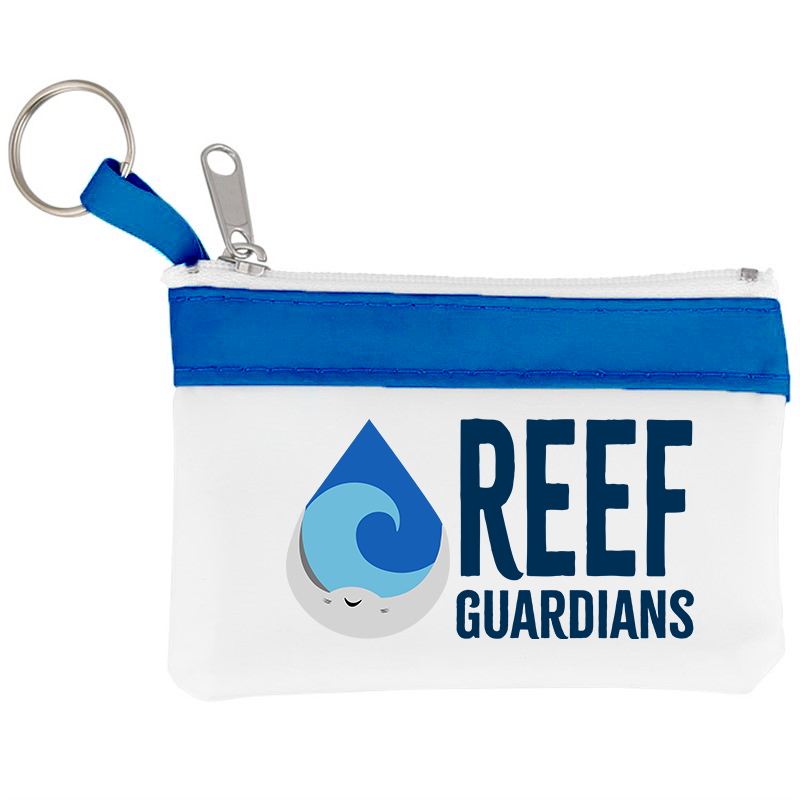
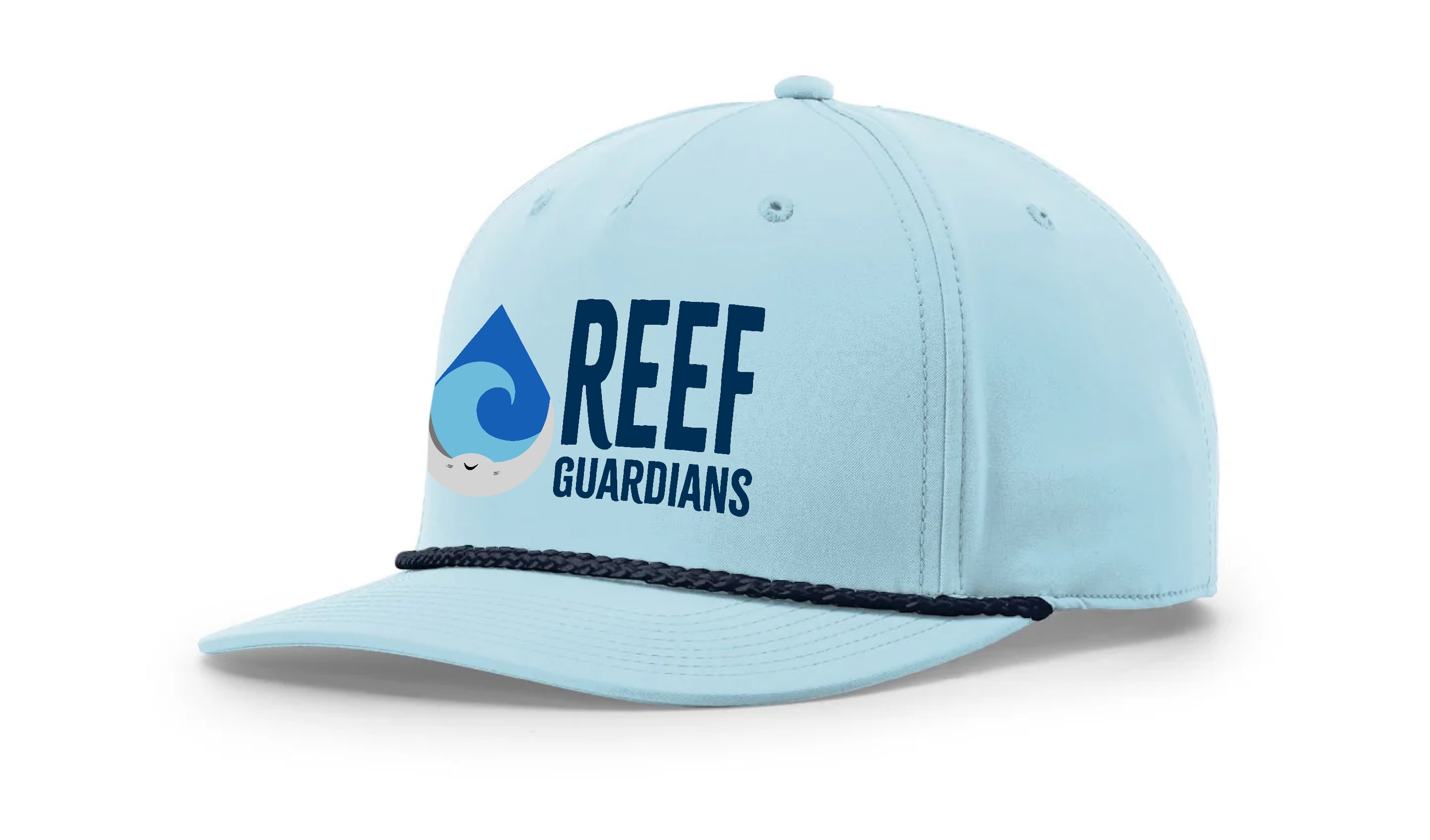
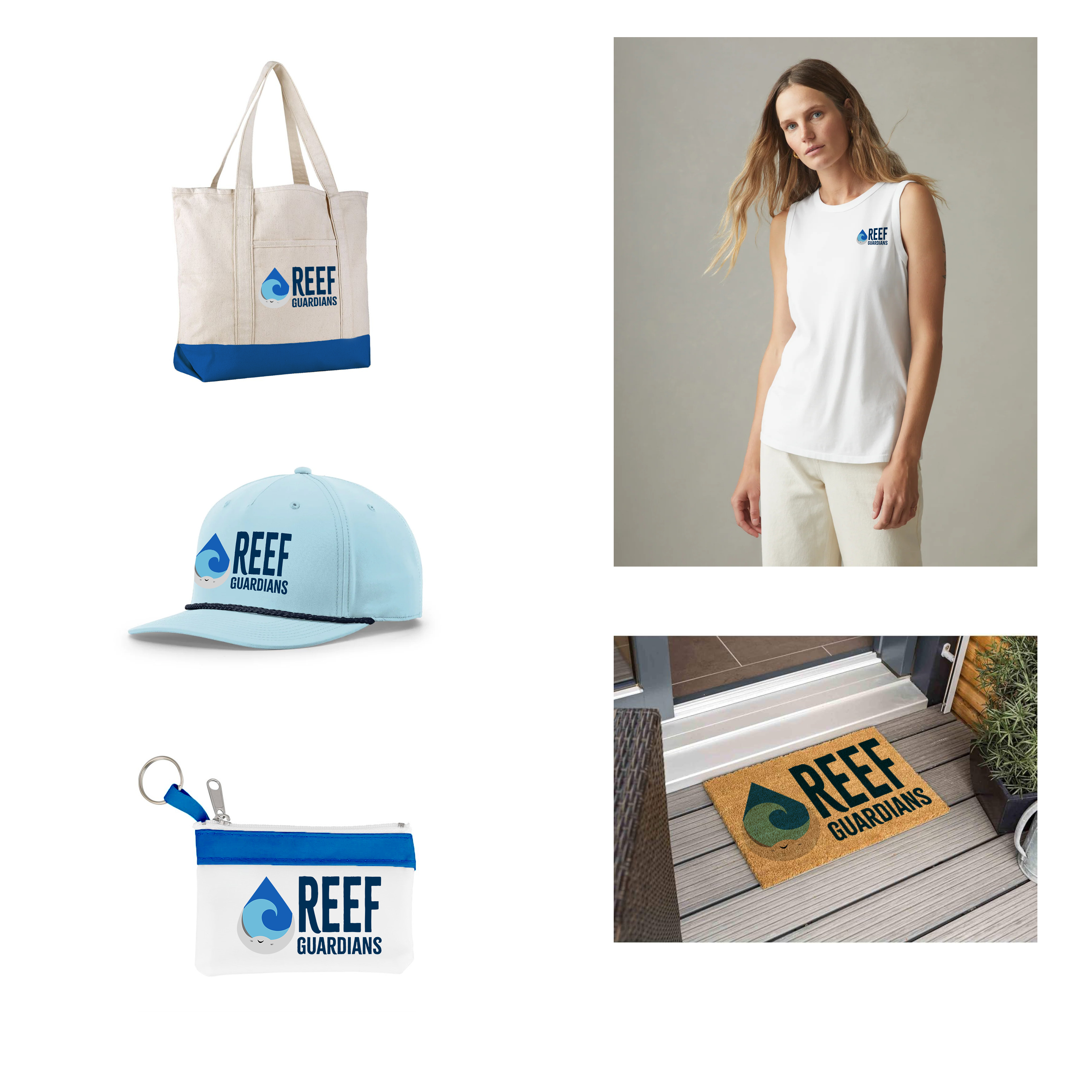
My role in this project consisted of researching the organization, sketching out variations of logo designs, creating the vectored logo on Adobe Illustrator, and creating mockup merchandise using the logo.